DIGITAL SCULPTURE
W/ ZBRUSH
To animate or construct a face, it would mean to create the very foundation of what emotions stand for and that alone facinates me. The idea of creating another one of us, until that reality becomes something we've ever imagined before.
We either grow our curiosity towards whatever we've created or fear it.
When being introduced to ZBrush, I immediately drew comparison to the likes of Photoshop, in which I was hugely mistaken by. My first impressions were that of the simpliticity of the layouts and how far I've realised technology have come to things like this in place.
I started playing around with controls and tools they had to offer and it didn't disappoint. As soon as I familiarised myself with the depth and intensity of these tools, I just went for it. I've started something.
Avatar
The facial features


Getting familiar with the structures
Male
Female


Male
Female
The Mandible


All this info of the structure helps completely debunk the myth that VFX is easy to do, even a stationary part of the human skull like the cranium, is equally as integral to letting the viewers recognise whoever this is in all sorts of angles. It is key to the proportion as the side of the cranium is typical where the eyes are located. In fact, I would argue the cranium is the core starting point of creating an ideal and realistic human face as it takes up just over 50% of its volume.

While labeling the key features above, I've realised the importance of how even the smallest part of the human face such as the nose bone or superciliary arches can alter an entire perspective and proportion of what kind of face you're aiming to create. They are integral to not only how it looks but also the movement of the animation while transitioning from ZBrush to other 3D-related software such as Maya etc.


Starting with the nose
w/ Dynamesh, subdivision & morph


Attempt 1
As we start with the nose since it's the easiest to do, we learn several commands such as smooth and move,
I added a concept of imperfection to counter the symmetry which brings out another level of realism.
It wasn't exactly the creation of the nose that was hard, it was balancing the smoothness and bringing out my interpretation of the structure that I found challenging but also oddly satisfying.
Using the dynamesh option enabled me to control the resolution and the number of polygons that will end up in the final result.
- Using the move tool to slightly tilt the nasal bone to the left.
- Differentiate the proportion ratio of alar fat.
- Customise depth of the inside of the nose.
Quick note*
Before I start adding the textures, the imperfection is reminiscent of an elderly's nose. As one of side of the nose start to lean on the other.


The mouth


Age is a big factor to how the mouth works, particularly the marrionette line and development of the mental crease and protuberance determines how far it could stretch and rotate whilst we eventually put our own creations into the animation aspect of this course.


A lot of today's comments about the 'uncanny valley' often comes from the softness and plastic feel of the mouth, as well as not letting light pass through. And it's just the mouth but also the ears and cheeks, this is called sub-surface scattering. But a great example of pushing boundaries is from Blade Runner 2049, by implementing motion capture, CGI creation and an actual actress ( Not Sean Young ) to act out the scene as the entire scene was shot in a practical set. The real time lighting and shadow reference helps a lot.

The upper incisors are a quarter bigger than the lower incisors. The canine teeth end up being offset by half a tooth. This continues into the molars.
When smiling the mouth naturally usually opens to the width of the canines. So working on the molars is usually only necessary if the mouth is to be opened wide.
Creating the mouth & chin
Blade Runner 2049


Using the same template, DynaMesh Sphere 128, we're introduced to a new tool called Dam Standard, it helps outline the lip and using the smooth tool as we start from the philtrum.
What was challenging for this excerise wasn't necessarily the mouth but everything around it. You could argue by creating any type of vermillion border there's bound to be someone that looks like this but it is the integrety and authenticity that we're trying to achieve, not by guessing. Visual effects are here to exhibit and tell a story.

Actress Florence Pugh was the initial inspiration while creating a feminine mouth.

Lennart Nilson
Lennart Nilson was able to capture such detail of human embryos with high fedelity, the photos below were taken in the mid 60s. Personally, this motivates me as it suggests that if this was to be achieved with much simpler photography technique over 60 years ago, we can most definitely created something familiar with today's visual effects, whether it'd be done digitally or practically.

Foetus at Thirteen Weeks, Spaceman, 1965
From both of these images, you can't fathom the fact that they are real, the context in history has shaped our mind into thinking it's done digitally and only can be done today.
The smoothness and subsurface-scattering on the fetus' skin is accurately placed and for an artistic approach, Nilson interpreted the creation of life is much larger than we realised by using paintings or deep coloured background to emphasise a birth taking place.

Photograph of a fetus, 1965
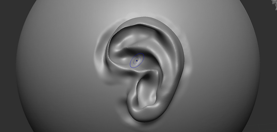
The ear


Just like the nose, the ear is made up of mostly cartilidges and easy to fold and the ability to stretch.

It could be argued that the ear is the least likely for people to recognise the gender but it's what's surrounding. From what I've learned about the skull, we can determine by observing the proportion/ratio between the ear and mandible.
Usually, the male ear takes up a third of the mandible's length, whereas ther female's take up roughly half depending on how pronounced the mandible is.
Several attempts on the ear


The eyes

Initial attempt of the eye sculpt


What I found the most challenging was how much cushioning the eye needed and getting it to look good in terms of the proportions in every angle was crucial.
Charles Le Brun


Declared by many as one of the greatest French artists ever, part of Le Brun's work involves the study of the eyes of all living things. This helped my research and practice into doing not only the movement of the eye, but the emotion that it brings.
Creating the eye with Maya

Blue iris

As we move to Maya to sculpt the eye, we also added additional texture from high quality images such as the blue iris and sclera. With the soft select tool, we can easily make out the shape and proportions for the images to correctly align with the model.


Via Poly Haven, I've selected an HDRI image that will provide accurate lighting for the eye in the final render, I went for an environment that will give a warmer reflection from the iris.
Using the smooth tool, it generates a far more realistic eye with a fully round shape rather than edges from the polygons initially from the model.

Sclera

Submissions of assignment 1
Throughout the process of making these sculpts, I realised the sheer amount of realism that had to be put in whether if it was the lighting, proportion and the depth within theses models. I believe I could do much more and improve overtime once I have the chance to put these together as I would think it would help me focus on the kind of face I'm aiming to build with ZBrush, this is was fun practice and a good assignment to start using what I've learned from 7 weeks of class.


Moodboard for the villain
My obsession with the cyberpunk world all started with watching Blade Runner 2049. The idea of showing the brutality of the future often has me go through the endless possibilities of how you can modify your body and with technology beyond our imagination.


In the world of cyberpunk, it all comes down to the details of what your features are that indicates any futuristic cyberware. It's not necessary the tattoos or the facial emotion that shows someone being menacing but it's the gadgets that lies within their skin.


Action units (FACS expression)


Quick feedback from peers
- "Mildly uncomfortable"
- "He wants to appear daunting to people out there."


